A Conversation with||Kim MacConnel: Oral History Interview July-August 2024
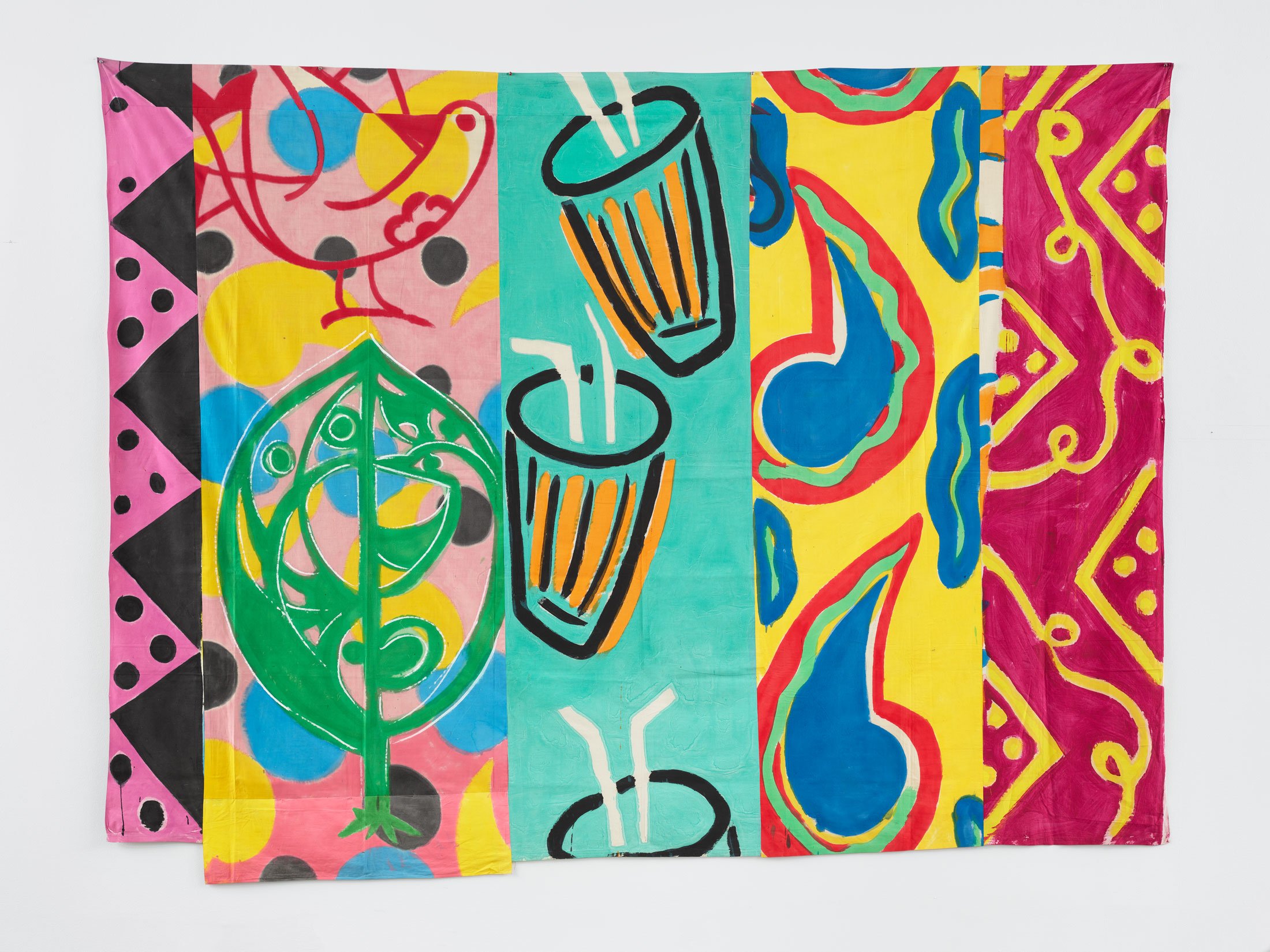
Kim MacConnel, Koka Kola, 1981, sewn acrylic painted cotton sheeting, 236.2 x 315 cm. Image courtesy of the artist and Luhring Augustine, New York. Photography: Farzad Owrang.
KIM MACCONNEL: Hi Clare, how are you going? How are you?
CLARE GEMIMA: Hi Kim, how are you?
KM: I'm good actually, but my little dog left us this morning just before dawn.
CG: I'm so sorry.
KM: Yeah it was… it's been a little rough. You know, I just haven't had to face this in such a long time. It was a bad night for her, but then she calmed down. She had something wrong with one of her lungs, and I think that's what brought her down. It might have been the cancer.
CG: How old was Ceci?
KM: She was about seventeen. Would've been seventeen in October.
CG: Wow, she lived an incredibly long life.
KM: Well, she did, yeah.
CG: Not that it makes it any better.
KM: No, it doesn't.
CG: Are you going to cremate her?
KM: No. I buried her this morning. I probably should have done that in the garden though, because down below the house, there's a really sweet spot where she'd eat raw asparagus straight out of the ground!
CG: Kim, will you get some time to relax today?
KM: Yeah, I will. I have been actually. I'm kind of kicking back, but trying to adjust to not having my little shadow behind me. I mean, life… life is different from here on out, but I had a good lunch, so I'm feeling a little better. There's no normal... normal...
CG: There's no normality today.
KM: No, I don't think so.
CG: Would it be a good distraction to talk about your work?
KM: Well, it's a tough subject that I have somehow managed to pick for the upcoming show.
CG: What's the subject?
KM: Climate change.
CG: Ah ha.
KM: A lot of it is tough. That's simply because a lot of it focuses on the downside of what climate change could do to people trying to better themselves by attacking other peoples and other nations… fighting nations. Like what's happening in Israel and Gaza, and now Hezbollah in Lebanon. But this is one of the aspects of climate change that is undervalued as a threat to life on the planet, so I branched out in my paintings because I couldn't fill the show with works like Koka Kola—they were non-political. And so I dipped into some of my war paintings, a couple of them, like Thunder Bomb (1981), which shows firecrackers and rockets.
There's also work from a previous series called Luft Geschäften, which translates in Yiddish to "Air Business." There was a story I came across about a father talking to his poet son, saying, "Oh my God! You want to be a poet? That's just… that's air business, that's luftgeschäft!" It's as though you're making your living out of nothing. And so I thought, well, that's like the military industrial complex, you know, it's just all "air business." It's all military, it's all wars, and support for wars. So the show includes some of those pieces that I haven't exhibited in some time. I might use a couple of them, in terms of cloth pieces. I'm also thinking about showing some gouache hangings in the small gallery.
CG: It's interesting, because the last time we spoke, you mentioned the Thunderbomb series, which came up as you were talking about ideas surrounding the military complex. You also told me about deciding to go to Vietnam, and then somewhat de-indoctrinating yourself in a lot of ways throughout the process. I'm curious about Scientific (1979) and Koka Kola (1981)—the two works you showed in Patterns, the recent group show spanning both Luhring Augustine's galleries. You say they're not political at all?
KM: They are, but they're not playing off a military theme in any way. I mean, I'm using Thunder Bomb, but I also have another piece where one of the panels depicts a nuclear explosion. Multiple explosions are taking place, and that's played off against something that's really just musical instruments—trombones, trumpets, and musical notes—as if to say "la-di-da, we're just marching along for eternity. We're not thinking about what's going to come down on top of us in terms of perhaps a nuclear war, or some kind of demise other than with climate change. Other than just crops being ruined, no water, and big storms—all that kind of stuff.
So that's another aspect that nobody has really… well people have… talked about, but it hasn't become a focus until the whole Israel-Gaza confrontation, so that's, to me, a kind of indication. I sort of ran with that in terms of thinking how this show may come together. It's going to be super colorful and really pretty nice to look at, but will also carry a large undercurrent of gloom, frankly. I'm going out on a limb here. It's made me a little bit uncomfortable… but I like it. So that's the next show in a nutshell.
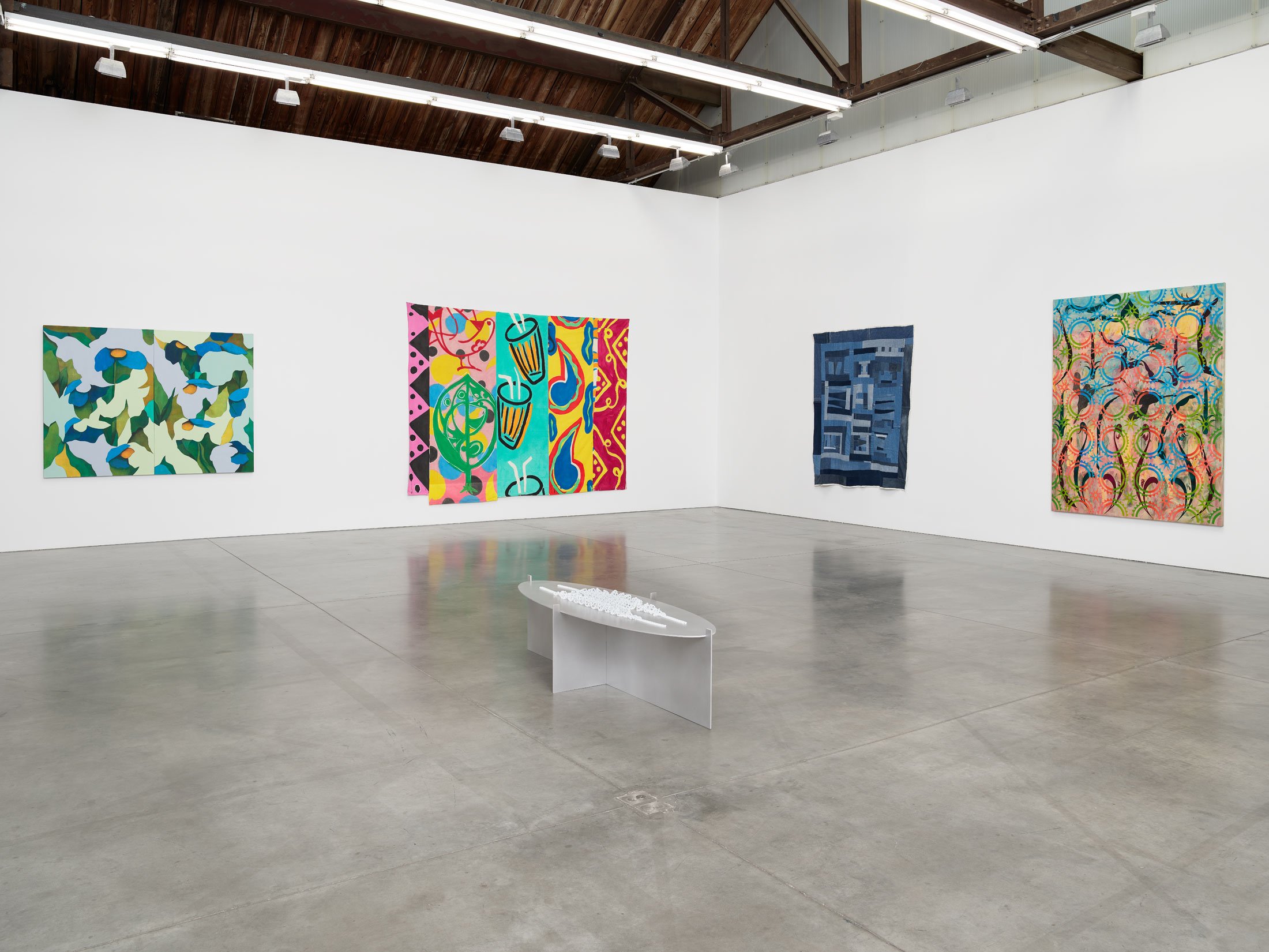
Patterns, Exhibition View, Luhring Augustine Chelsea, New York, 2024, Photo: Farzad Owrang.
CG: Speaking of discomfort, let's go back and focus on Patterns. You told me there was some discomfort, I guess, in exhibiting in Chelsea, for lack of a better phrase. To be part of this group show, to perhaps be the only artist in the show that was part of the Pattern and Decoration movement… could you expand on that discomfort?
KM: Yeah, that’s true. Well, first off, P & D has taken a beating over the years, as you probably know. That’s why I was surprised to be invited to be part of Patterns at Luhring Augustine. I didn’t expect anything. I thought that I wouldn’t have much say in any kind of show at that level, especially after Holly Solomon died and her gallery had closed down. The only other gallery I managed to get an exhibition with was James Salomon, who was a friend of Ned Smyth. Ned had talked to James about picking me up and doing something. That’s how that materialized, but not much came of it. Going on seventy-eight, I thought, well, that’s kind of the end of that.
CG: Happy recent birthday by the way!
KM: Thank you. I'm very happy to be seventy-eight. I am! But it's made me think about the end of my life, and whether I have enough in me to do another couple of shows. I am doing the second show for the gallery in October, and so it was a really big surprise that Lawrence Luhring had the confidence to give that to me. I thought, wow, that's really trusting. A nice sign that I'm in good favor. (Laughing)
But to me, Chelsea has always seemed somewhat awkward, although that's where James had his gallery, on 25th Street. After Holly died, I went around to a number of galleries that I thought I'd have some cachet with, but nobody was interested. When I pressed Lawrence and asked him why he chose me to be part of the Patterns show, he said, "Well, I've followed your work for years, and I really like it. I've always really liked it." So there was somebody out there, I just hadn't managed to find them. The gallery is right next to Gagosian… a little problematic to me. I see Chelsea and most of its galleries as being really focused on the bottom line with their artists. I'm just not in that position anymore, nor do I want to be. I guess that sums up a small part of my discomfort.
CG: So, the awkwardness of what galleries expect from their artists mostly?
KM: Yes. My direction with this follow-up show has made me a little uncomfortable, because I’m exhibiting an aspect of myself which is kind of like my death wish in terms of showing in a new gallery, doing something with an edge to it. That might not be comfortable for the gallerists. But I’m committed to that, and I think actually doing a show about an aspect of climate change, and following that as a subject within the art world, is a really good thing. And really important. It may be my last show, and that doesn’t bother me. I like that, in fact. I like being tested like that, and seeing if I can pull it off.
Right now, I'm in my studio, staring at the wall where I've mapped out the upcoming exhibition—I've visualized the main gallery with the larger paintings alongside my smaller works. Unfortunately, they're basically the same size as the big paintings—the small gouaches—but they'll show in a small room with another large hanging. I was thinking about including some furniture in there, maybe a lamp, maybe a mask too.
CG: And has there been a name figured out for the show, at all…
KM: It may well change. Maybe the working title is Nature, Science, Commerce, but I'm not sure. In that light, I was thinking of sending you an image of the show's layout.
CG: That would be great.
KM: Your publication also wanted a picture of me, a portrait, preferably with some of my work around me. So I sent them something that captured me in front of a commission that I did for this woman's dining room in La Jolla, which is quite monumental. It's a picture of me, looking very small in scale. But it's a picture of me, and so I was very happy with that.
CG: I guess I won't see it until this is published, but I'm sure it's beautiful.
KM: Yeah. I think either photo will work, but I like the one where I'm being dwarfed by the big monumental hanging.
CG: I also took that amazing photo of you standing in front of Koka Kola. You also look quite dwarfed by that one too.
KM: Yes. (Laughing)
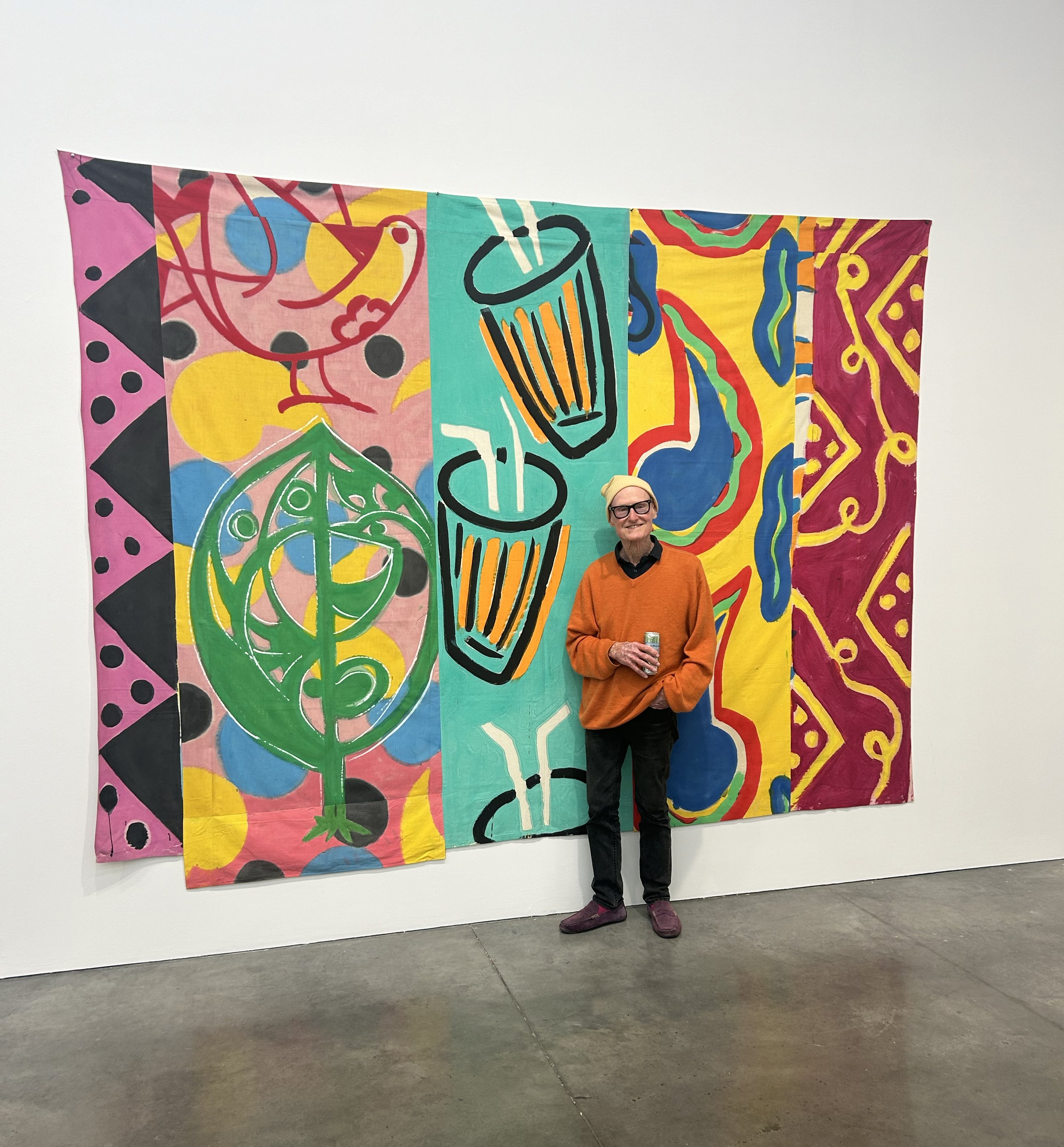
Kim MacConnel at Patterns opening. Photo courtesy of Clare Gemima
CG: I was hoping we could talk about Koka Kola and Scientific. Your bedsheet paintings. I'm aware that you've drawn inspiration from a wide variety of sources, which have gradually built up your textile collection over the years. Given this, I'd love to hear how you approach composing these pieces, even though you've explained your process countless times to me already.
KM: Sure. First off, all the sheets from the early ’80s came from thrift stores; some actually had holes in them, some were kind of worn out, or they had stains on them, many things. But I used the thrift store stuff because I couldn’t afford anything else, and at one point I started to really enjoy painting on them, so I just kept doing it. I would paint the full bedsheet on a pinboard wall in my garage, and then I would cut them up. I would tear strips out of them, and pile them up until I had what I thought was a number that I could work with, which was probably around one hundred. That’s a number of bedsheets to accumulate, because there are about five or six strips per bedsheet.
Then, because the strips are all different-sized lengths, I would pin them up on the pin board wall, and leave them there so I could consider them for structure. I let the light fall. I didn't have light in the studio, so I let the light go by until day became night. Once the light dropped, the color dropped too, and you could see black, white, and gray tones. Like a gray tone structure of the forms. That was always really interesting to me, figuring out if the pattern that I was playing with transitioned across the gaps, across the strips in a way that was actually cohesive. That really gave me confidence, once it found cohesiveness, and was a pretty interesting way to make a painting, rather than following a traditional compositional path.
CG: So, Kim, while structuring different textiles together, placing pattern against pattern against pattern, how or when does the "cohesion" occur?
KM: You'd expect it to be an overload, yet the subject of each individual pattern shifts once it's reduced to strips—a truncation technique I adopted from Eastern textiles, especially those produced in Iran that were used as linings for traditional coats with extraordinarily long sleeves. They would end up with these scraps, but they would not throw them away, they'd actually make a new piece out of them. That truly became a revelation for me, that you could take a single pattern, and by flipping it around or interrupting the repeat of the pattern, you could, in strips across a surface, reconfigure its composition almost infinitely. Over all of these columns moving from left to right, or right to left, the patterns start moving vertically, top to bottom, bottom to top, whatever. They would engage with the next pattern over in terms of diagonals or straight lines, harmoniously or in contrast, and that really fascinated me in terms of how to use patterns in a way. That was new to me.
All it took for me to do was just paint on these bedsheets and then tear them up. So I'd get little strips of the next bedsheet to make the next column as they'd carry the warp and weft of their predecessor, and by their fifth hand-me-down use, they no longer obtained straight lines, so you'd get this bleeding from the next form over. That added a bit of sloppiness, looseness, and also opened it up to different interpretations
CG: It’s interesting because I’m looking at an image of both Koka Kola and Scientific, and it seems like you’ve matched strips with similar color opacities, Koka Kola being quite vibrant and saturated, compared to Scientific’s more pale tones.
KM: Again, I don't know if that's always deliberate, although for the most part, it is, yes. Controlling with the cloth, controlling the liquid, the viscosity of the paint versus the water content was really important. Because if there's too much water, the color seeps out first, and it leaves the paint behind. I didn't want that. When I'm brushing it on, I want the brush to carry both the pigment and the water along the pattern that I'm making, or the subject that I'm painting, and not have it bleed out, or have fuzzy edges, drips, or anything like that. I try to keep it uniform in a certain way.
That harks back to the critical ideas Clement Greenberg promoted in the '50s that influenced artists like Morris Louis with his poured paintings, and others. That to me was an irony that I don't think was lost on the Abstract Expressionists, but it was in terms of the '60s conceptual art that I went to school with. It allowed me to go back and look at patterns and forms that I'd find in material like wallpaper that had been usurped, therefore using it in terms of art making seemed null and void. I wanted to resurrect that. That was what some people referred to as my "conceptual minimalist approach" to painting pattern. I thought that was a great critique; it also claimed my work was unlike what anybody else was making. Except Robert Kushner. Bob was very much engaged in the same conversations as I was.
CG: I'm curious about the original bed sheets… what they looked like before you'd start tearing them into strips. Were they initially color-blocked before you painted patterns on them, or were you tracing a pattern that was already there?
KM: Most of them were white bedsheets, but sometimes they had polka dots embedded in them, or they could've been tinted blue. At one point, I started mixing fabrics with patterns alongside those without, just to see how they could enrich the vocabulary I wanted to play with. In several other pieces heading to the next show, I used figuratively patterned bedsheets, so tearing out strips of them would reveal single figures—say, like a bullfighter, and in the distance there's a bull that he's whooshed his cape over. So that's just one column. Then the next column features some kind of gestural pattern.
In Koka Kola, one panel has two peacocks on it. I found illustrations of them in a children's book that I bought someplace in India in 1978, during a residency there. I re-made the pattern myself. In some cases, I used found patterns, and in other cases I would reference wall paintings similar to advertisements found outside stores selling sandals or shoes, or those related to TV repair services in small villages in Mexico, India, or various countries across Africa. I continuously strived to expand this vocabulary, and include as many different kinds of patterns and images as I possibly could.
Of course, not all of that worked out. That's exactly why, once I'd gathered a number of these strips together, I would pin them up on a wall, assemble something bigger than what the piece would be, and just try out these strips until they told a story that appealed to me, presented a theme, or formed some kind of physical compatibility or disjunct between one another. An openness or closeness. I realized I had discovered a great set of tools that I could expand on and work with, to the point where the act of painting them almost became incidental to my skill set. I wasn't trying to make beautiful paintings in a traditional sense. I was a journeyman painting something. Basically filling a space.
CG: It's fascinating to hear how themes and new types of narratives, beyond their original contexts, emerge as you make. The strips themselves have their own stories too. The challenge of finding cohesion with these strips creates a brand new pattern, balancing the nuanced remnants of their original form—once whole pieces, now truncated. It makes me curious as to how you approach painting your bedsheets in comparison to, say, applying paint to a piano, chair, or other piece of furniture?
KM: I think they're all different kinds of canvases. They all invite different approaches. So, as an example, before I painted the chairs for Izhar Patkin's Chez es Saada, I hadn't made any paintings for about a decade. I was just taking photographs from traveling and making things out of those, mostly about different cultures. When he asked me to paint those little marshmallow chairs, I got out some rollers, and I just thought alright, let's do this. It was just so easy. Within two weeks, I had painted all of the furniture for the restaurant. It was automatic in a way, just one pattern after another. But it was all the same pattern. It worked because of the kind of chair it was. It wouldn't work with others—I've tried it and it hasn't been as successful as it was on those little muffins. But, to your point, I had to gain a new sense of confidence, because at the time I was taking most of my imagery from Chinese ad books that I'd collected, and creating patterns from those.

Kim MacConnel, Interior of Chez es Saada restaurant. In Collection Applied Design: A Kim MacConnel Retrospective (La Jolla: Museum of Contemporary Art San Diego, 2010).
CG: And, if my memory serves me correctly, these were images of Chinese military figures?
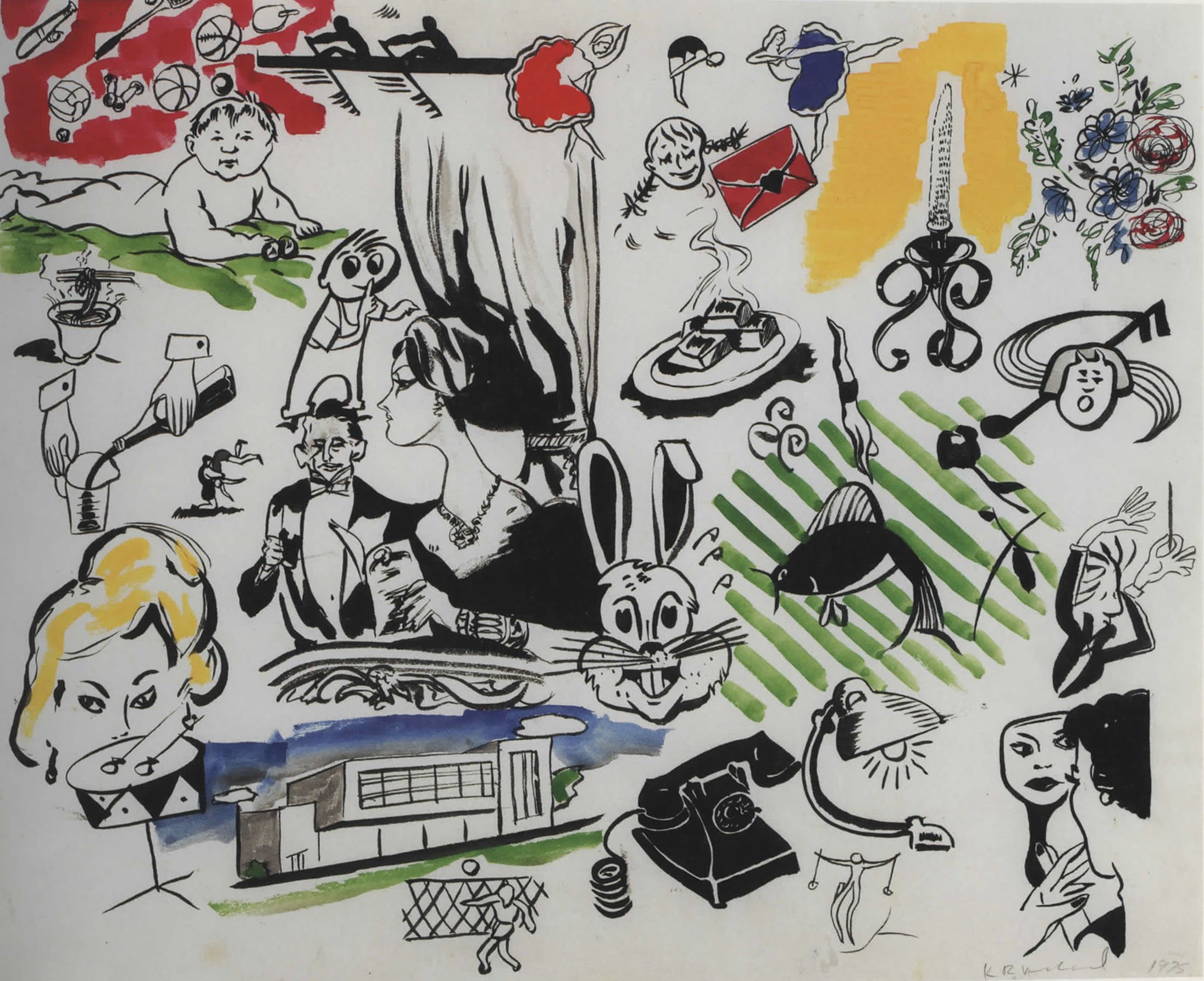
KM: Oh, there were all kinds of things! There were traditional Chinese family pictures that showed traditional Chinese dress, fathers talking to their children, people milling about, people walking down the street, and then there were all sorts of drawings that the author of the book would put together from other publications which were almost encyclopedically categorized. But, what I first came across was a book that didn’t have any categories, it was random. So you’d have a Hawaiian woman hula dancing with a dachshund and a bumblebee on the same page. It didn’t make any sense at all. And I went, oh, well, this is giving me political liberty to do the same thing—absolutely anything I want! So I made a series called Ten Items or Less (1975), in which I just copied these images with brush and ink onto a piece of paper. Sometimes they included more than ten images, and sometimes they illustrated fewer, mostly more. It became the first body of work that I created from those ad books.
Before I had made any cloth or bedsheet pieces, I made sketched strips that I copied from ad book images or other sources in a sketchbook. I had five sketchbooks altogether. At one point in the late '90s, Holly asked me if she could borrow them, and I had told her that I hoped that she would not extract fragments from any of them, and just keep them as books—I thought they'd be responsible for my retirement fund at the time. Surely enough, she took them out and framed about fifty of them.
CG: I believe I've actually seen one of these framed fragments hanging in Izhar's studio… but the intention was to not cut them out of your sketchbooks at all?
KM: Well, I just wanted them to be there as a record of my thinking. They were records of my engagement in which the main product became the cloth pieces. They were never intended for sale; they were completely non-commercial. I just made them to keep them. At the end of my life as an artist or what have you. Maybe I would've used them, or sold some of them. But I was also making bigger paintings using just brush and ink. My figures just ended up floating on the surface, as though they were stories in and of themselves.
CG: I've seen these in Art-Rite's compilation volume¹. You have hundreds of sporadically placed figures going about their day, facing away, farming, laughing, crying.
¹ Issue 17 of Art-Rite (1977) was edited by Walter Robinson and Edit DeAk.
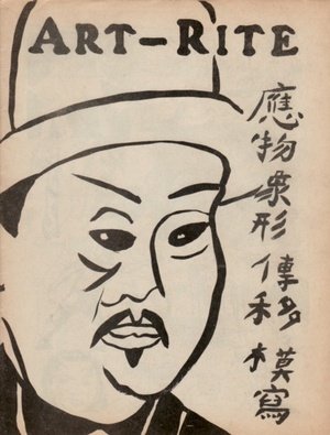
Kim MacConnel, cover of issue 17 of ART-RITE. Edited by Walter Robinson and Edit deAk, and published in New York in 1977.
KM: Yes. They were all made on paper, and as I developed my painting skill. Because that was one of the first things I had a revelation about when I came across these little ad books in Chinatown in New York: that this was calligraphy. If I use a brush with ink, or a brush with black paint on paper, I’m basically forming a type of calligraphy. I was taking graphic images that were created for publications, advertisements, or anything that’s selling something the author of those books puts together to spur consumers’ interests. Think newspaper ads, something like that.
CG: Like classifieds?
KM: Classifieds or something like that. You know, like checkbooks that have little ad images on them that depict something about your business. So they’re very simple graphic images that somebody invented. And what I wanted to do was take those graphic images… and give them a hand. Make my hand do it with a brush. So at first, I was learning how to use a brush, which I’d never really used before, especially not small pointed brushes. So I used them. This was after I got out of grad school. So I said to myself, “Okay, let’s see if you can learn how to paint with a brush.” And that was how I learned. I also made something that I could sell. A simple idea: under ten items. It didn’t matter how well or poorly I did it. It was just that there were fewer than ten items.
Kim MacConnel, Ten Items or Less, 1975. Gouache on paper. 15.5 x 21 in. Courtesy of the artist.
CG: This moment essentially marked the beginning of your painting career?
KM: Right. Because everything I made during graduate school was kind of a joke. It was meant to be a joke. It was kind of like...
CG: Was it cheeky Kim?
KM: It was very cheeky, yes. As my advisor, David Antin, said to me,“Kim, I think you should try and get a show at a head shop.” (Laughing)
CG: Oh boy!
KM: And I went, "Oh, maybe so." But no, I had higher ambitions, if you will. I wanted to show in New York.
CG: You saw your drawings as calligraphic. Do you think these sorts of observations could have initially sparked your intrigue with pattern? Chinoiserie is springing to mind too… What do you consider a pattern?
KM: Well, it's part of the same thing or quip, yes. One has to think about the idea of pictorial composition as a traditional form of painting. Within that, you can do design work, a design that is part of the painting, like Matisse's wallpaper within a piece that's featuring a woman, a subject, a portrait—something going on behind the subject. That's a lot of painting. Almost anybody's compositional painting from history to the present has stuff in it that's not important to the painting, but it sets the tone or image. It's secondary, but it's taken as seriously by the painter. Painting somebody's dress, coat, trouser wrinkles, or what have you, as an example. Somebody takes those details very, very seriously to get it right, so to me, it's convincing. In my case, I didn't think I had to make my work convincing at all. I'm covered by the idea that I'm painting ten items or fewer. I'm not claiming there's any kind of quality to them. It's just that I have a task and it's to paint ten of them. Ten of something. Ten different things.
CG: And that was essentially the only risk, the only parameter that you set yourself?
KM: Exactly, the only parameter. But within that, I'm using a brush and ink, or black paint to paint it with rather than a stylus. By just using a plain brush in itself, you get a lot of wobble. There's a lot of mark making that goes astray that you have to correct for. You have to get it back to the image you were trying to render in the first place. My goal was to get as close to the graphic ad book images as I could, but using a brush, which made it look a lot different to a graphic. I had a lot of leeway to fail and it didn't make any difference. 'Cause sometimes I hit it, and sometimes I didn't.
In showing people these pieces, nobody seemed to look at them and go, "Oh, well, you didn't do very well on this image," or, "Why not draw better images?" Nobody ever said that. They all said, "Oh, this is really interesting." (Laughing)
I'm very simple. I take these kinds of clues and I just run with them. So yes, that's how I ended up with a career.
CG: It seems very difficult to understand how you'd be able to amalgamate so much variance into one object, one painting, one artifact.
KM: Right. It's all happenstance.
CG: Does uniformity go out the window?
KM: Uniformity can be cacophonous, sloppy, or very precise. I threw that criterion out and just went with what I could produce. Like most artists, I got better and better at doing what I was doing with an instrument that I, at first, felt very awkward using: a tiny little pointed brush. That to me was a conceptual aspect that made these pieces both interesting to me, and seemingly unique in terms of what I was seeing in galleries around me at the time. I wasn't doing anything like it. I remember thinking that no artists were embracing haphazardness as an aesthetic.
CG: Or any accidents…
KM: Yes, or accidents.
CG: So when you were looking around galleries in New York, you didn't necessarily see people painting on anything but traditional structures, as an example?
KM: Yes, absolutely. Hardly anybody. And if they were, they might have been somebody from another country. Like Mexico. It was almost as if someone had asked them to paint an advertisement for their television repair shop, just as colored TVs were becoming a huge new thing. The mindset of the painter could've been something along the lines of "I could repair a colored TV, so I'm going to paint that on the outside of my building. I could paint a regular TV, or I could paint a color TV. I can repair both, so that's my business."
Mexico once had a tradition, at least in parts like the Yucatán, of using visual keys to create conversations by way of painting street store signs. In Mérida, there are streets called Old Man Street, or Old Woman Street, and nearby there'll be a painting of a bust of a man or an old woman on a corner to indicate that. One would navigate the city with the help of illiterate indios prior to Spanish conquest, even post-Spanish conquest, by looking at these paintings—finding something more easily or not getting lost. People would advertise, say, their veterinary clinic where they'd treat cows for bat bites, so they'd paint a huge brahman bull with a vampire bat landed on its shoulder, sucking its blood. Something like that makes a great painting to me.
CG: Thinking interculturally, and cross-traditionally, where have you found the best textiles. What place in the world?
KM: Oh, India.
CG: Yeah, I knew you'd say that. I already knew the answer.
KM: The residency I did in 1978 was with the Sarabhai family in Ahmedabad, in Gujarat. They were a very wealthy family, and some lived in an enormous compound that was bigger than a New York City block. They dabbled in petrochemicals, but they also made textiles that they sold to the Japanese market, and maybe also Iran and other places, to sell to clothing stores. But they were also interested in the historical aspect of textiles, so they funded and created the Calico Museum, which is filled with rare textiles from all over India. Different types of weavings, embroideries, very complex use of metallic and colored threads, even some mirrors and other kinds of things were woven into the embroideries. It's truly mind-boggling as a collection.
The director of the museum was a really interesting gay man who took a liking to my work. While I was there, he spent a lot of time watching me while I painted. He’d just come over, and hang out. When we’d visit the museum, he’d take me into the vaults where everything that wasn’t displayed was kept. He showed me unfathomable textiles from the seventeenth, sixteenth, even twelfth century. Of course, I borrowed extremely heavily from this brief education—I was only there for about a month and a half. I produced fourteen paintings, half of which I left in Ahmedabad, with my host, Anand. He was a microbiologist working on fruit flies. What I mean is, like, lantern flies… some flies that have fluorescence… fluorescent…
CG: Phosphorescence?
KM: More like effervescent fluorescence.
CG: That would be a good name for a painting.
KM: It would be, yes. Absolutely. (Laughter)
CG: There's a microscope motif in Scientific. Was that inspired by Anand?
KM: The microscope became a fairly regular stand-in to represent science. Scientific's central focus is more on the wings of the very large butterfly in the painting's far-right edge. It was painted as a negative, using wax. It's a batik method, another I came across while looking at textiles.
CG: What is the negative wax method?
KM: You paint wax on to the cloth, then remove it, so the raw cloth picks up the dye, but is prevented from embedding. It gets through some cracks—that's just an interesting byproduct—but it doesn't penetrate the wax. You use a hot iron with blotting paper to remove the wax. The heat helps get rid of most of it—almost all of it. It's an Indian method from Gujarat. In Rajasthan, there's a wax resist that is done by knotting. You take a little piece of the cloth and you squish it together to make a bulb, and then you tie it off with thread. Some of these might only be an inch apart, so the cloth has been reduced from eight-by-eight to two-by-two feet. There's so much knotting, and then they dye it. In other cases, like in Bali, they used wax relief. So it's just two different ways of doing the same thing: preventing the dye from saturating the raw fabric.
CG: It’s interesting, most of the inspiration you’re telling me about is Asian inspired. Going back to P & D times, when you weren’t really seeing any artists doing what you were, apart from Robert Kushner, do you think it was because artists weren’t looking beyond a Western sensibility or vocabulary?
KM: Exactly. So both Bob and I, that was our pet peeve and our motor. Our drive was to look at the world. Frank Stella’s Exotic Bird series (1977) came from what he was working with on misprinted tin. They'd be from soda cans, or other kinds of products like peas, but they were all misprinted. He was using cut pieces for the base, and he then painted on top of them. It made these really interesting shapes. He embedded and twisted them onto a grid, then welded them down, or had one of his workers weld them down for him. When he was about to leave the residency, Anand said, "I want to take you on a tiger safari in one of the parks. But let's… let's talk business first." And then he said, "You know, Frank, I just want to remind you that you're going to be leaving half of your work here." Frank flipped out.
CG: So Frank Stella went to the same residency before you did?
KM: Yes. I spoke to Frank before I went to India. He allowed me to go prepared. So his response to Anand was something like, "I don't want to go on the tiger safari. I'm going to work instead. I need to duplicate every single one of my pieces." He got right to work, and within two weeks he had duplicated everything. That was the beginning of his three-dimensional series of works that he's been working on ever since, including the work that was in Patterns, that big piece. Let me just see what that work was.
CG: That was Hiraqla Variation II, made in 1968?
KM: The Hiraqla Variations, yeah. So he was using protractors for that. So that's just prior to him going to India and coming across this tin material that he then could bend and shape and form and paint on. So if you ever saw one of his earlier Exotic Birds, you would just howl a little.
CG: Speaking of Stella’s work, which we saw in the gallery, were there any other artists in the show that stood out to you? Ones you were familiar with, or weren’t so familiar with until now? There were so many works in the show.
KM: Yes, very much so. Let me get my cheat sheet…
Philip Taaffe, who works very differently with stencils. He’s spray painted something on the ground, then he’s gone back in and spray painted using a stencil, or multiple stencils, and proceeded that way. And the Pettways, Qunnie and Loretta Pettway: Human’s Jeans, the denim tapestry. Athos Bulção from Rio de Janeiro. He had the big piece as you walked into the gallery. It’s a tile panel. I thought it was beautiful. I liked Eric Mack’s piece, Strewn Sitbon, and Yves Zurstrassen’s SLOW DANCE. Emily Krauss’s piece was interesting in terms of mark making. I spent a long time looking at her piece, Agon. Alfred Jensen, too. He’s really old school. The River Diagram: Lo Shu, the one he made in ’71. It’s almost going back to pre-pattern and decoration. A use of repetition, rather than pattern.
CG: It's almost like a big chess board?
KM: Yes, exactly. Like what's her name? Who made... Oh, I'm just blanking on her name. She makes metal plaques that are gridded with little dots—red and black dots. Quintessential New York artist, very minimal.
CG: Jennifer Bartlett?
KM: Jennifer Bartlett. I'm surprised she wasn't in the show, 'cause her works play with repetition. I also liked Ryan Mrozowski's Split Painting. It was an interesting kind of interlocking series of forms that created the image. He had another piece called Dot which was terrific. You know, I actually thought the whole show was interesting. Some works were old school, some were new school, some were pictorial, but compositionally, there weren't many that focused primarily on this kind of strip engagement…
CG: The strip engagement is yours Kim…
KM: Maybe—the slices of things, or patterns stuck together to create another kind of interchangeable slice. A slice of life.
This interview was edited for length and clarity.
August 2024